





Two clients.
Two crowds.
Two completely different jobs to do on the same square canvas.
This is a short portfolio of two recent mock-ups: a carousel for CSIRO’s @csirogram, and an infographic for The Conversation Australia & New Zealand’s @theconversation.aunz.
Here’s how each one came together, and the strategic thinking behind every design choice
CSIRO: Why Mardi Gras hits different (according to neuroscience)
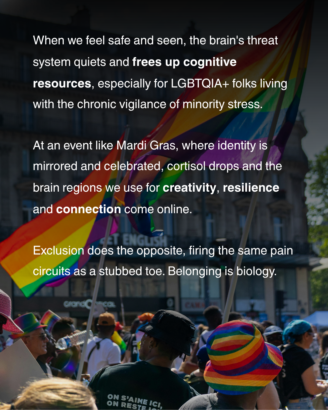
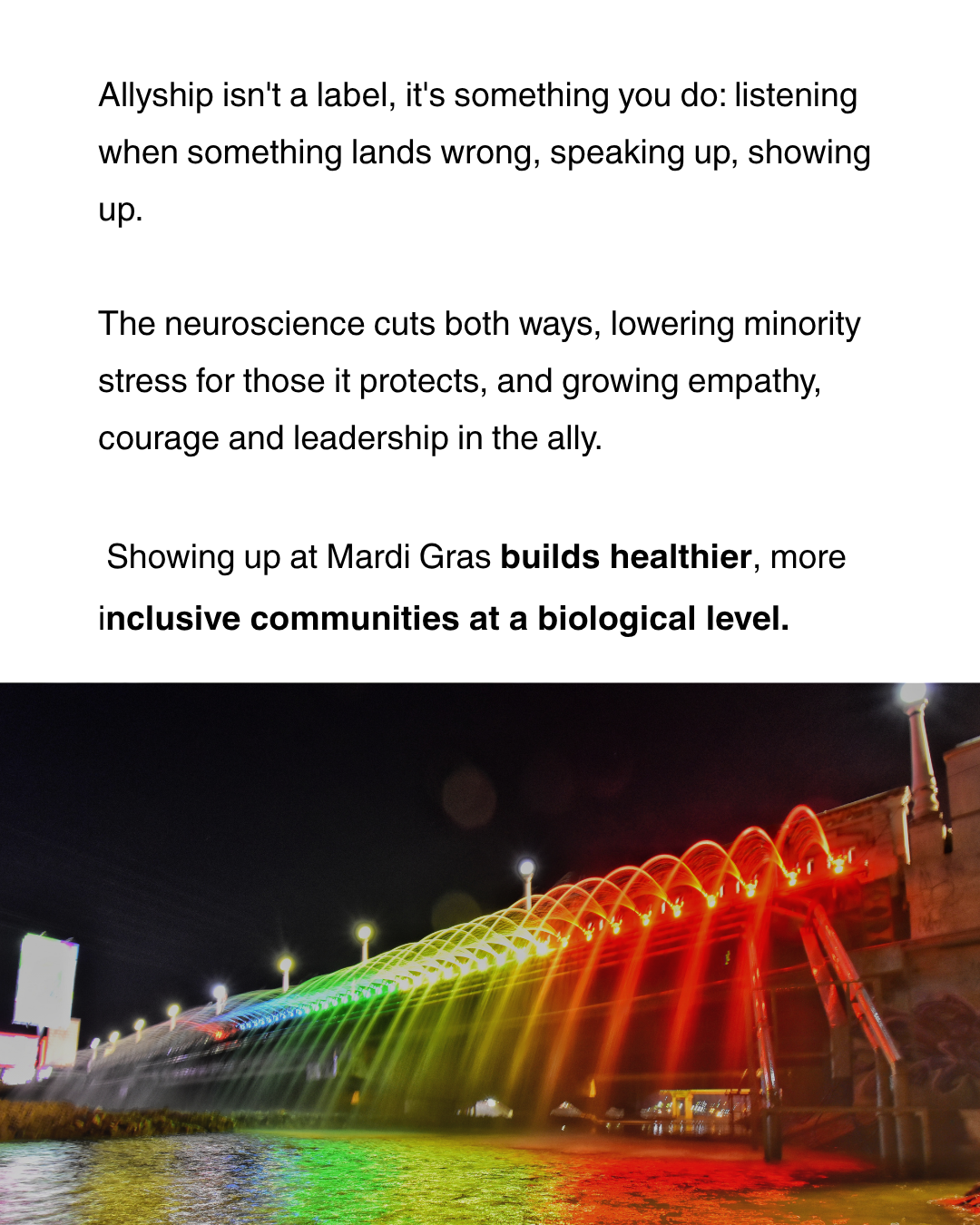
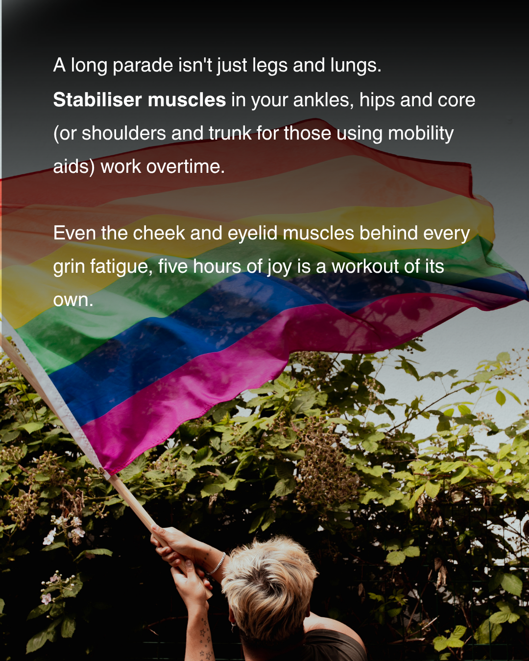
Caption, Hashtags, CTA & Img. Alt Text
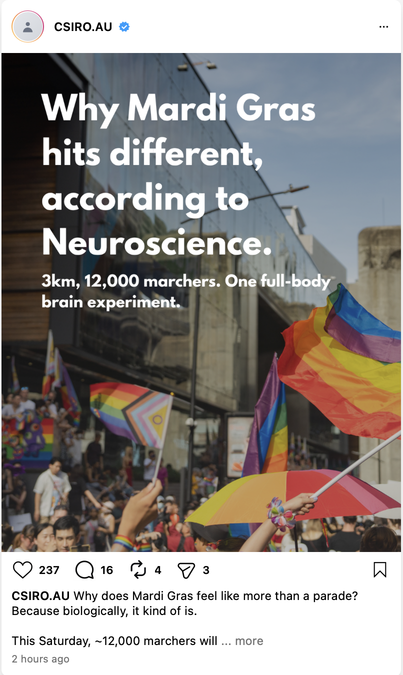
Why does Mardi Gras feel like more than a parade? Because biologically, it kind of is.
This Saturday, ~12,000 marchers will move 3km along Oxford Street, and your body and brain are running a remarkable experiment the whole way.
Swipe through to see what’s happening under the rainbows:
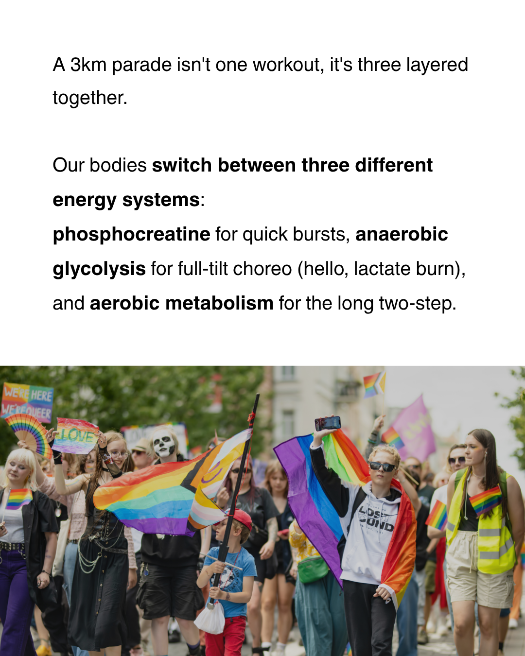
- Three energy systems firing in sequence to fuel the parade
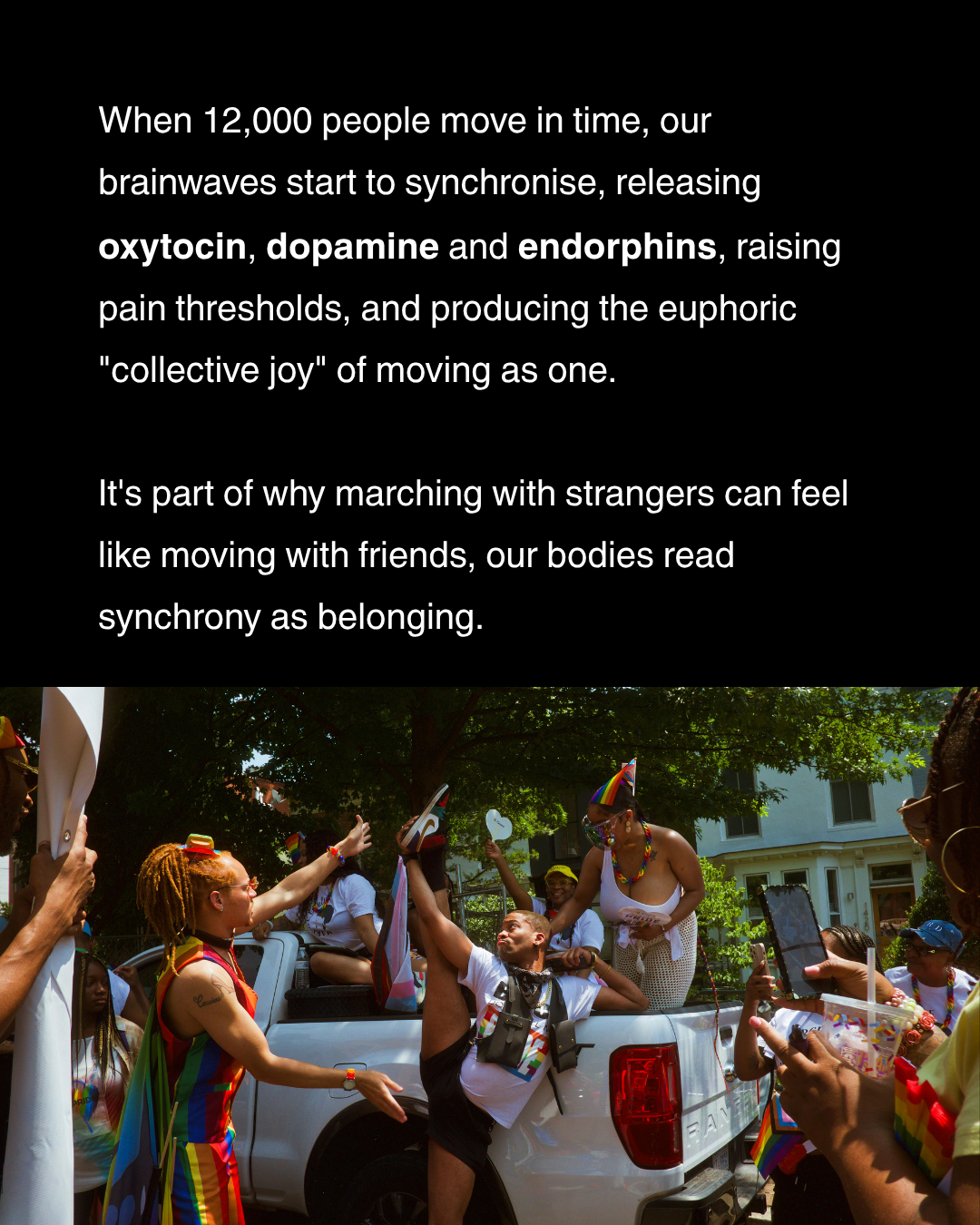
- Brainwaves syncing across thousands of strangers
- Oxytocin, dopamine and endorphins flooding the system
- Cortisol dropping when identity is celebrated, not policed
- Even the cheek muscles behind every grin clocking overtime
The takeaway? Belonging isn’t just a feel-good idea. It’s measurable, biological, and it builds healthier communities at a cellular level.
🔗 Tap the link in our bio for the full story.
#CSIRO #AusScience #ScienceOfMardiGras #MardiGras #SydneyMardiGras #Neuroscience #BelongingIsBiology
Alt-text: Screenshot of an Instagram carousel post by @csirogram. The first slide shows a Sydney Mardi Gras parade scene with a Progress Pride flag held aloft, a billowing rainbow flag, and crowds before a tall reflective glass building. Overlay text reads: ‘Why Mardi Gras hits different, according to Neuroscience. 3km, 12,000 marchers. One full-body brain experiment.’
Reflective Analysis:
CSIRO’s @csirogram has a defined visual signature, clean white cards, bold sans-serif type, a restrained palette of navy and charcoal anchored by a single bright accent, that prioritises scientific clarity over flourish. For this brief I deliberately pivoted toward a photo-led, magazine-style treatment to meet the 18-30 audience where they already engage on Instagram, while keeping CSIRO’s core typographic discipline: a single bold sans-serif system, generous hierarchy, and no decorative typography that would erode the brand’s authority. The slides alternate between full-bleed Mardi Gras photography and white text panels, echoing CSIRO’s existing rhythm of ‘image then explainer’, but at a higher emotional temperature than their usual feed.
The key message, belonging is biology, was chosen because it does what science communication for this audience needs to do: it folds the article’s neuroscience into a single, scrollable claim that frames identity and inclusion as measurable rather than abstract. Rather than leading with three energy systems or sprite discharges (the article’s most technical content), I selected the human-impact thread: brain synchrony, oxytocin and endorphins, cortisol drops, the pain circuits of exclusion. For an audience that values the intersection of STEM, social inclusion and major cultural events, that framing turns a parade post into something with civic weight, while still rewarding curiosity with detail.
Tone was calibrated to the same target. Captions are casual but accurate (‘hello, lactate burn’; ‘five hours of joy is a workout of its own’), modelling CSIRO’s nerdy-but-warm voice without slipping into dry academic prose or trend-chasing. The CTA, Tap the link in our bio for the full story, mirrors @csirogram’s standing strategy of routing IG traffic to long-form articles on csiro.au, rather than asking the audience to act off-platform. The hashtag mix, anchored by #CSIRO and #AusScience for brand reach, with #ScienceOfMardiGras and #BelongingIsBiology to ride event-based discoverability, keeps the post legible to both regular CSIRO followers and Mardi Gras scrollers.
These choices are grounded in Marwick and boyd’s (2011) account of context collapse and the ‘imagined audience’ on social platforms: because every post addresses a flattened, partially-imagined readership, creators succeed by writing for a specific, plausibly-present subgroup rather than for everyone at once. The 18-30 STEM-and-inclusion audience is exactly that constructed audience, and every micro-decision, photographic style, language register, CTA destination, hashtag mix, was made with that imagined reader in the room.
The Conversation: When lightning is more than just a bolt
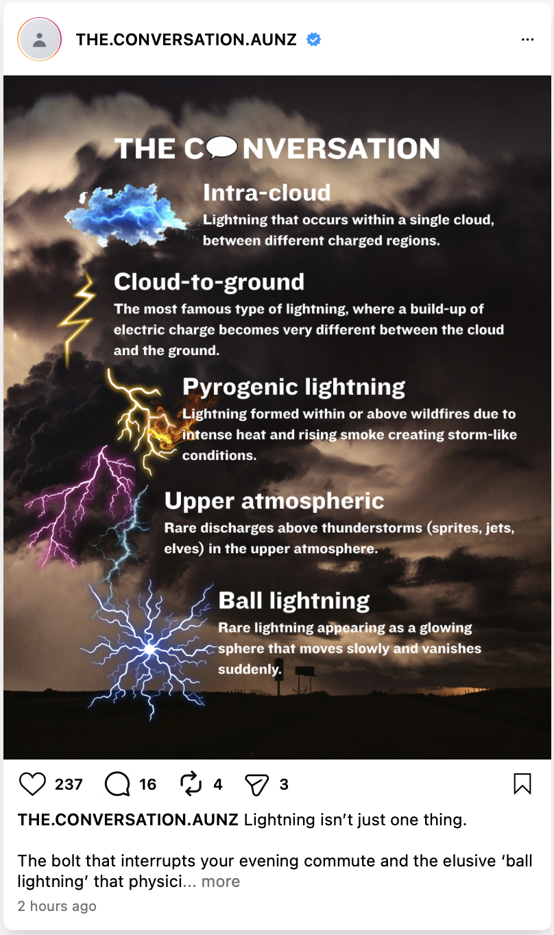
Caption, Hashtags, CTA & Img. Alt Text
Lightning isn’t just one thing. The bolt that interrupts your evening commute and the elusive ‘ball lightning’ that physicists still can’t fully explain are part of the same atmospheric family, but they form, behave and look remarkably differently.
A new piece for The Conversation traces the full spectrum: from the everyday cloud-to-ground strike, to the sprites, jets and ‘elves’ that flicker high above storm cells, to the increasingly common pyrogenic lightning generated by intense wildfires.
For anyone who has ever wondered what’s really happening up there during a storm, or why some forms of lightning are becoming more frequent, it’s a worthwhile read.
🔗 Tap the link in our bio for the full article.
#TheConversation #LightningScience #AtmosphericScience #Meteorology #ScienceExplained #AusScience
Alt-text: Educational infographic titled ‘The Conversation’ on a dark stormy sky background. Five lightning types are illustrated and labelled in a vertical sequence:
(1) Intra-cloud: lightning within a single cloud, between different charged regions; (2) Cloud-to-ground: a large difference in electric charge builds up between cloud and ground; (3) Pyrogenic lightning: formed within or above wildfires from intense heat and rising smoke; (4) Upper atmospheric: rare discharges (sprites, jets, elves) above thunderstorms; (5) Ball lightning: rare lightning appearing as a glowing sphere that moves slowly and vanishes suddenly.
Reflective Analysis:
The Conversation Australia & NZ’s @theconversation.aunz uses a visual language that signals ‘academic rigour, journalistic flair’: a small palette dominated by their signature orange and navy, sharp sans-serif headlines paired with a serif accent for the masthead, and a strong preference for editorial photography over decorative illustration. For an infographic, that translates into clean typesetting and a strong reportorial frame, graphics shouldn’t compete with the journalism, they should escort the reader into it. My infographic uses a moody storm-sky photograph as the field, anchors The Conversation’s actual logo at the top, and runs five lightning types as a clean vertical typology, each labelled in the masthead’s bold headline style, each paired with a representative bolt illustration.
The key message, that lightning isn’t one thing but a family, was chosen because it does the work of an editorial infographic well: it gives the reader something genuinely new (a taxonomy they probably don’t have), without trying to compress the entire article into the square. For an audience aged 35–45, university-educated and looking for evidence-based deep dives, an over-simplified one-fact post would feel beneath them; a wall of text would feel like homework. Five labelled categories is the right shape, enough to reward attention, structured enough to read in three seconds.
Tone is more measured than the CSIRO carousel. Where that piece allowed playful asides, this caption opens with a thesis (‘lightning isn’t just one thing’), credits the article’s authors implicitly through the source link, and treats the reader as someone who already values the form. The CTA, Tap the link in our bio for the full article, mirrors The Conversation’s actual social-to-site funnel: their bio link rotates to the most recent featured article, so the phrasing is both audience-trained and platform-native. Hashtag use is similarly restrained, six tags, not fifteen, to match the account’s confident grid aesthetic.
These choices are informed by Leaver, Highfield and Abidin’s (2020) work on Instagram’s visual cultures, which traces how educational and journalistic accounts have adopted the platform’s aesthetic conventions, square framing, vertical hierarchy, branded type systems, without surrendering institutional authority. The infographic is built to sit comfortably inside that lineage: recognisably ‘an Instagram thing,’ but unmistakably The Conversation, leveraging the platform’s visual grammar to distribute long-form journalism to a scroll-economy audience that wouldn’t otherwise click through.
Need someone who can pivot between two voices on the same feed without losing what makes either of them yours?
Take a look at the rest of the portfolio, or get in touch via the contact page, I’d love to hear what you’re working on.
Thanks for reading my work,
Ethan Strybosch :)
References:
Leaver, T., Highfield, T., & Abidin, C. (2020). Instagram: Visual social media cultures. Polity Press.
Marwick, A. E., & boyd, d. (2011). I tweet honestly, I tweet passionately: Twitter users, context collapse, and the imagined audience. New Media & Society, 13(1), 114–133. https://doi.org/10.1177/1461444810365313
Hunt, D. (2026). From bolts to blue jets: Lightning comes in many strange forms. The Conversation. https://theconversation.com/from-bolts-to-blue-jets-lightning-comes-in-many-strange-forms-268197
CSIRO. (2026, February). The science of Mardi Gras. https://www.csiro.au/en/news/All/Articles/2026/February/science-of-mardi-gras
Media Credits:
Brief 1: CSIRO carousel
• All slides designed by me using Canva (https://www.canva.com/en_au/) under the Canva Free Content License Agreement.
• Slide 1 — background photograph: free licensed image from Canva
• Slide 2 — background photograph: free licensed image from Canva
• Slide 3 — background photograph: free licensed image from Canva
• Slide 4 — background photograph: free licensed image from Canva
• Slide 5 — background photograph: free licensed image from Canva
• Slide 6 — background photograph: free licensed image from Canva
• Caption, hashtags, alt-text and overlay copy: written by me.
Brief 2: The Conversation infographic
• Infographic designed by me using Canva (https://www.canva.com/en_au/) under the Canva Free Content License Agreement.
• Storm-sky background photograph: free licensed image from Canva
• Lightning illustrations (intra-cloud, cloud-to-ground, pyrogenic, upper atmospheric, ball lightning): free licensed graphics from Canva
• Caption, hashtags, alt-text and overlay copy: written by me.